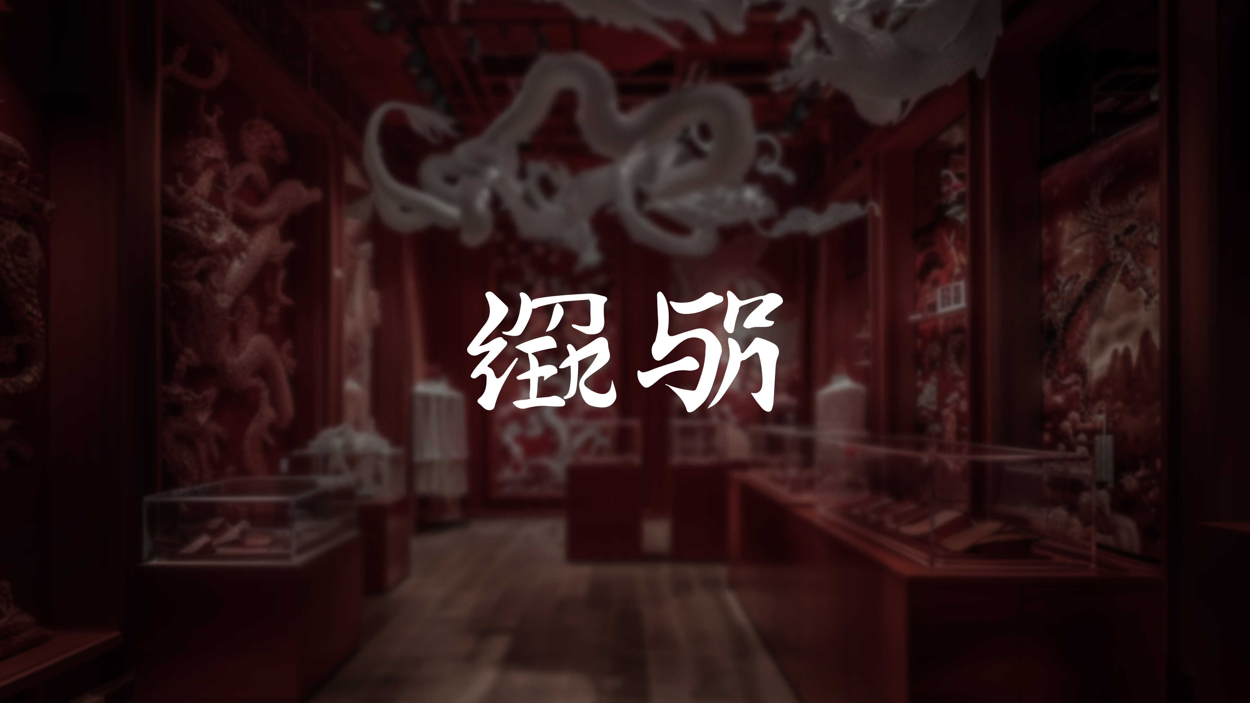
Midjourney generated retail space
Week 8
After finishing my research paper, I used the information I had discovered to come up with concepts for my imaginary brand. To narrow down topics that I want to focus on in my brand, I thought of thinks I am interested in. I am interested in fashion so I would want my brand to be related to fashion. As my products needs to be easy to test, and for my target audience to pick it up, I decided for my brand to be a fashion accessories brand.
Speaking from a brand owner's perspective, I am a Asian brand that aims to combine
fashion design with technology. Chinese culture would be the inspiration of my brand. I
want to develop a brand experience for my business in order to attract a new audience
and give them the chance to test out my goods. Bringing the audience completely into my
culturally-derived brand identity and assisting them in understanding the inspiration
behind my first product, the eye of the dragon, which was inspired by Chinese culture's
year of the dragon, are the two main objectives of my brand experience.
The rationale behind selecting a Chinese-influenced brand was really
straightforward. In an attempt to avoid complicating, I began by analysing myself.
Though choosing Chinese culture and having a dragon in the year of the dragon may seem
like an easy way out, I felt that the brand wasn't really the main attraction, so that's
the quick concept I had. From the standpoint of the brand experience, I want to create a
gamified experience based on my dissertation findings.
I started by coming up
with my brand's logo. I chose the brand name "EMERSON" as I was keeping with the idea of
taking bits and pieces of myself. I was inspired by the K-POP group RedVelvet, where
they had a logo for their recent album, which looked a lot like chinese characters even
though it was in english. I wanted to try a similar concept for my logo as I thought it
would be quite fitting for my brand.
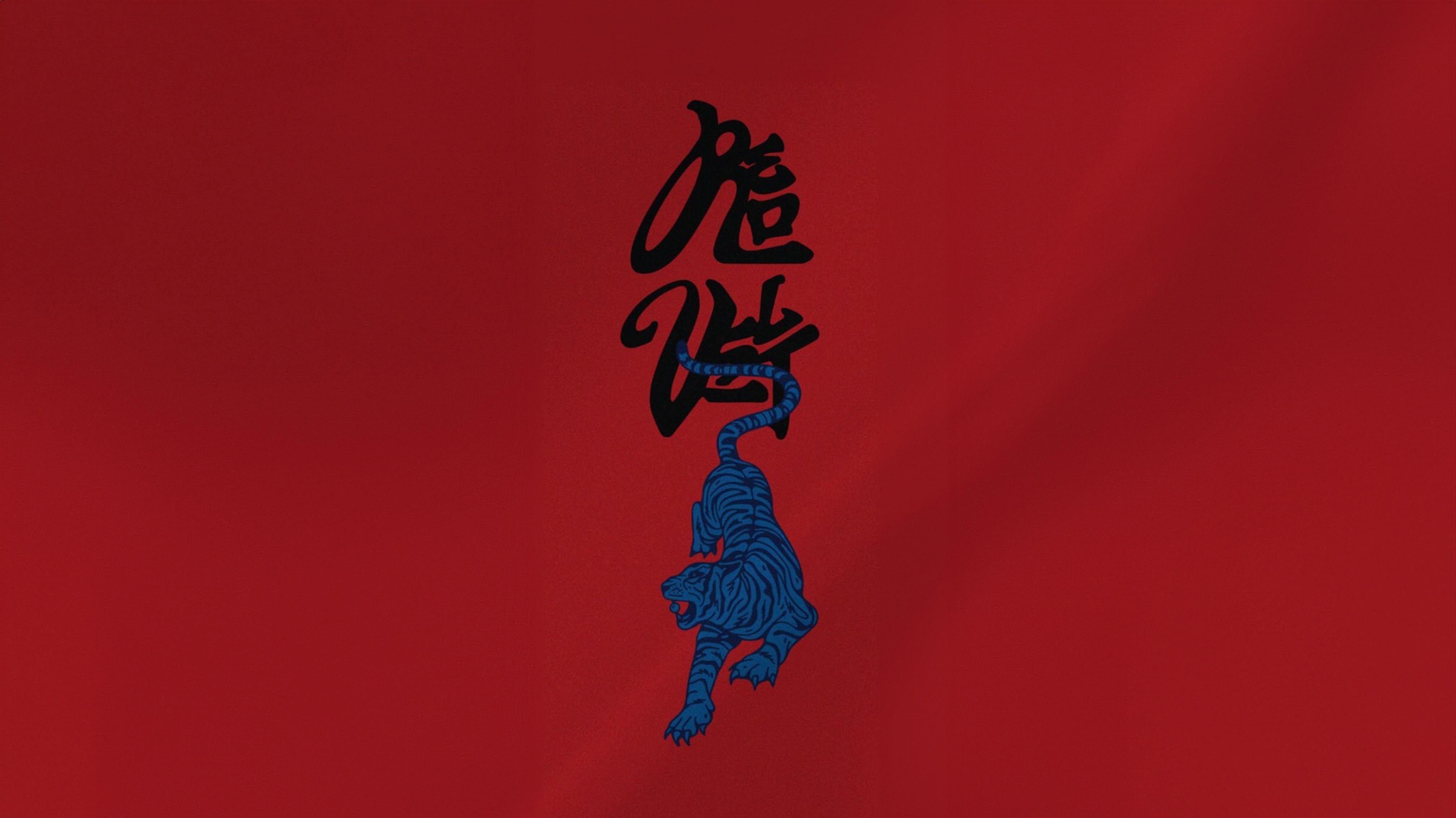
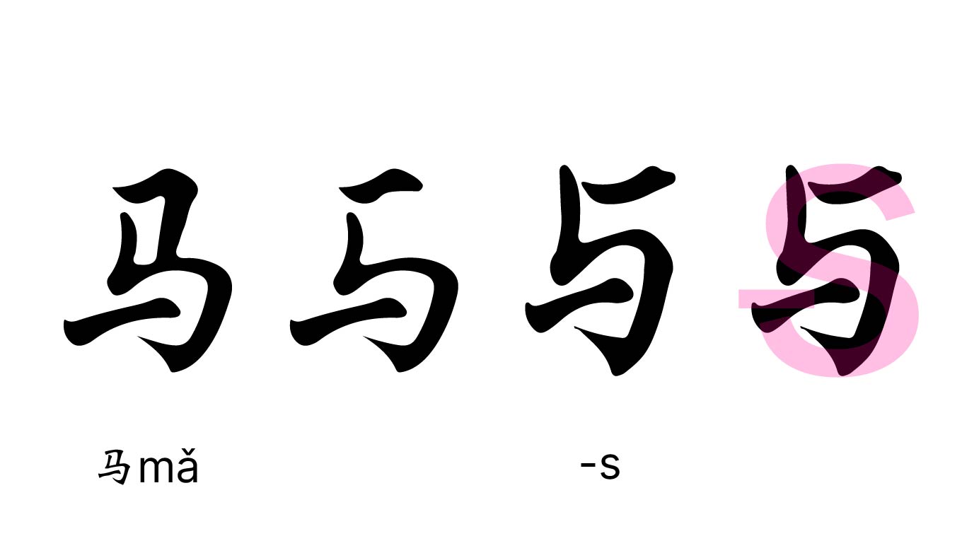
I had to separate my brand name into two parts before I could design the text. I made the decision to have SON be the second Chinese character and EMER be the first. I began working on the SON design first. Chinese character 马(ma), which means horse in Chinese, was the first character that sprang to me when I wanted to find characters that resembled the shape of a S. Taking advantage of the comparable appearance, I slightly altered it to resemble the shape of a S while keeping the common traits of Chinese letters.
The letter O resembles the character 口 (kou), which means mouth. There was nothing to alter because it already matches the shape of the letter O. Lastly, the letter N resembles the Chinese character 力(li), which means force. I changed the character to match a lowercase n, much like I did with S.
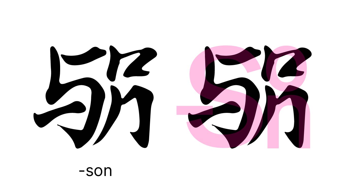
I built created a character for "-son" by assembling and stacking them following the logic of Chinese characters.
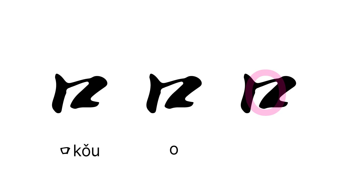
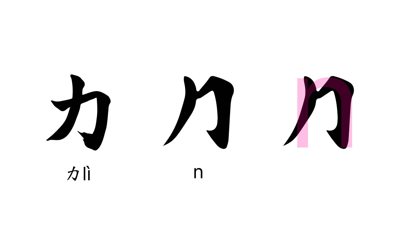
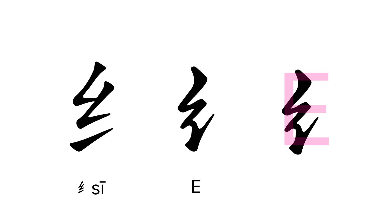
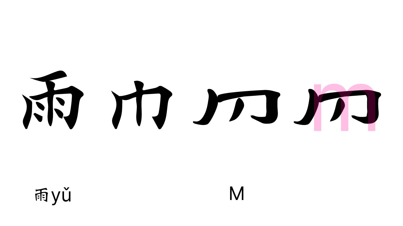
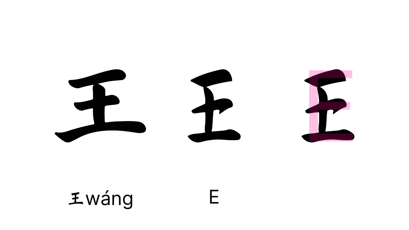
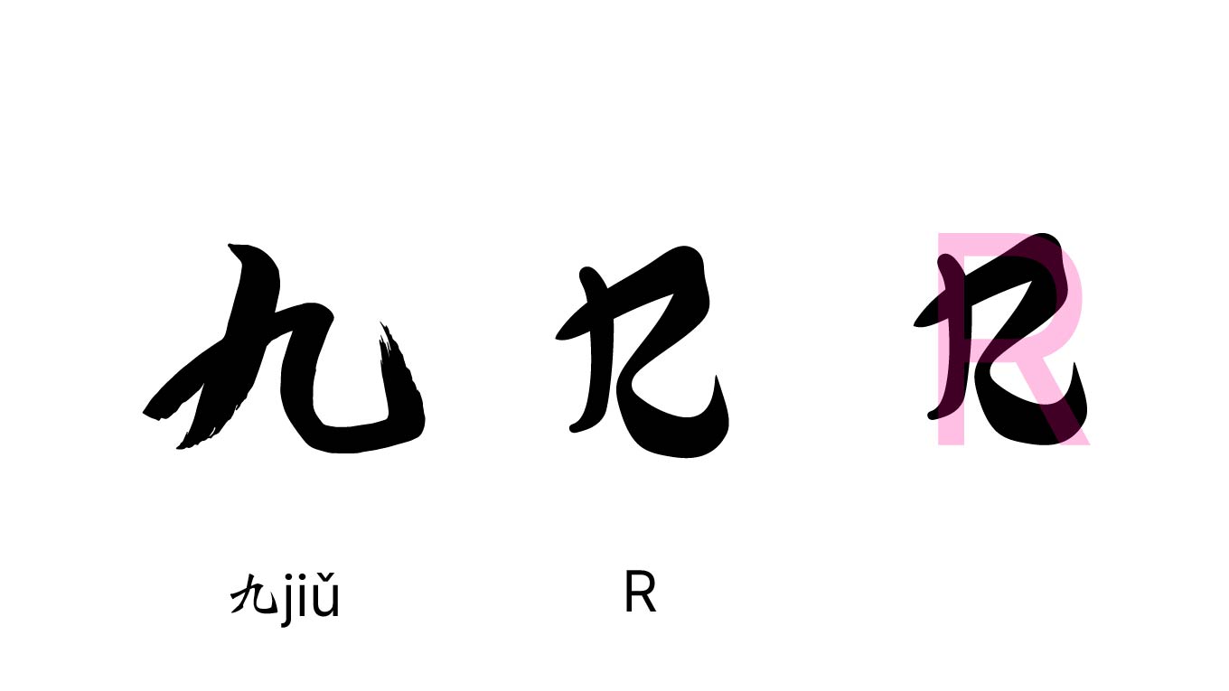
I finished the characters for "son" and moved on to the first part of my logo, which is EMER. I only required to slightly alter the shapes of several of the characters, including like 纟(si), 王(wang), and 九(jiu), to make them resemble the English character shapes. In contrast, I had to modify and eliminate other components from the original character 雨 (you), which means rain in Chinese, so that it resembled the shape of the English character. I used this to make EMER's Chinese character.
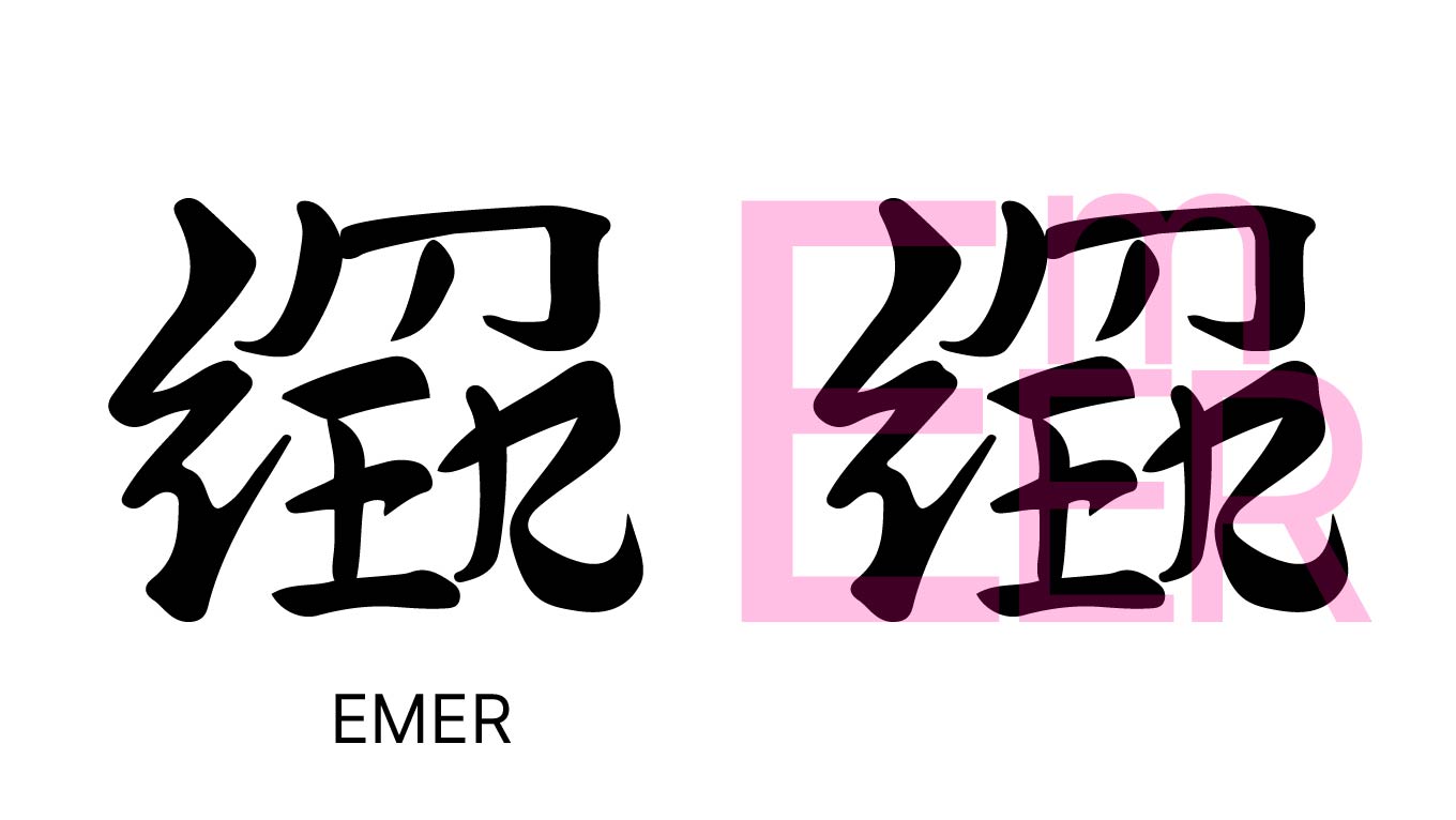
After deciding on an idea, name, and logo for my company, I can begin by identifying the aesthetic I want for it and incorporating those design elements into the overall feel and look of my brand.