Week 6 & 7
Based on the user testing and comments collected, these are some conclusions we may
draw. I would refer to the deep attention prototype and the hyper attention prototype as
Prototype D and Prototype H, respectively, to keep things simple.
Every
participant
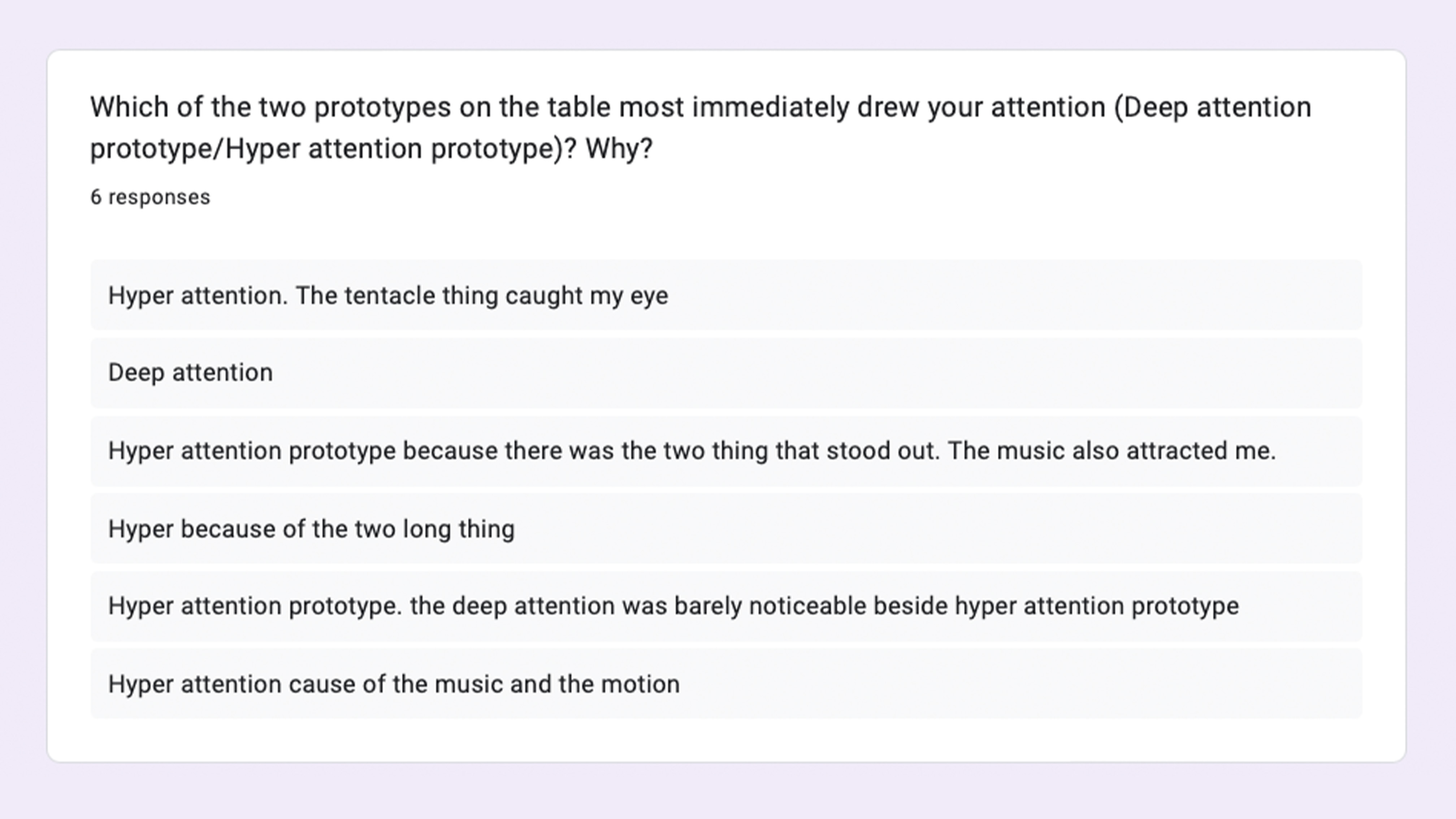
concluded that Prototype H—which is a moving tentacle-like object—was the more visually
striking of the two prototypes, while Prototype D is just a circuit board that is easily
overlooked. One participant did, nevertheless, choose Prototype D as their answer;
however, it was subsequently made clear that this selection was made due to a misreading
of the question. The tentacle mechanism's intriguing appearance drew the participants in
and made them feel compelled to approach it.
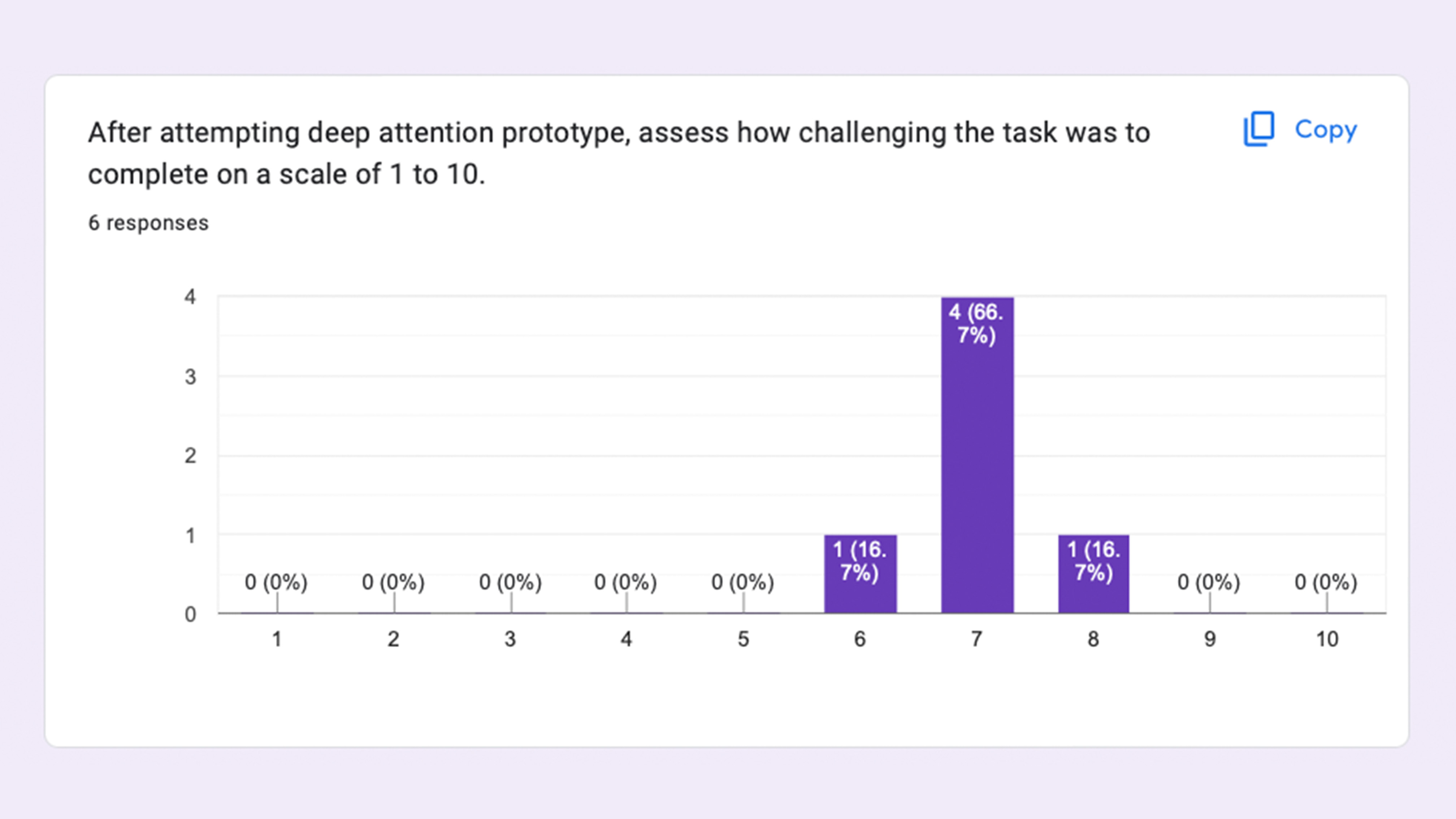
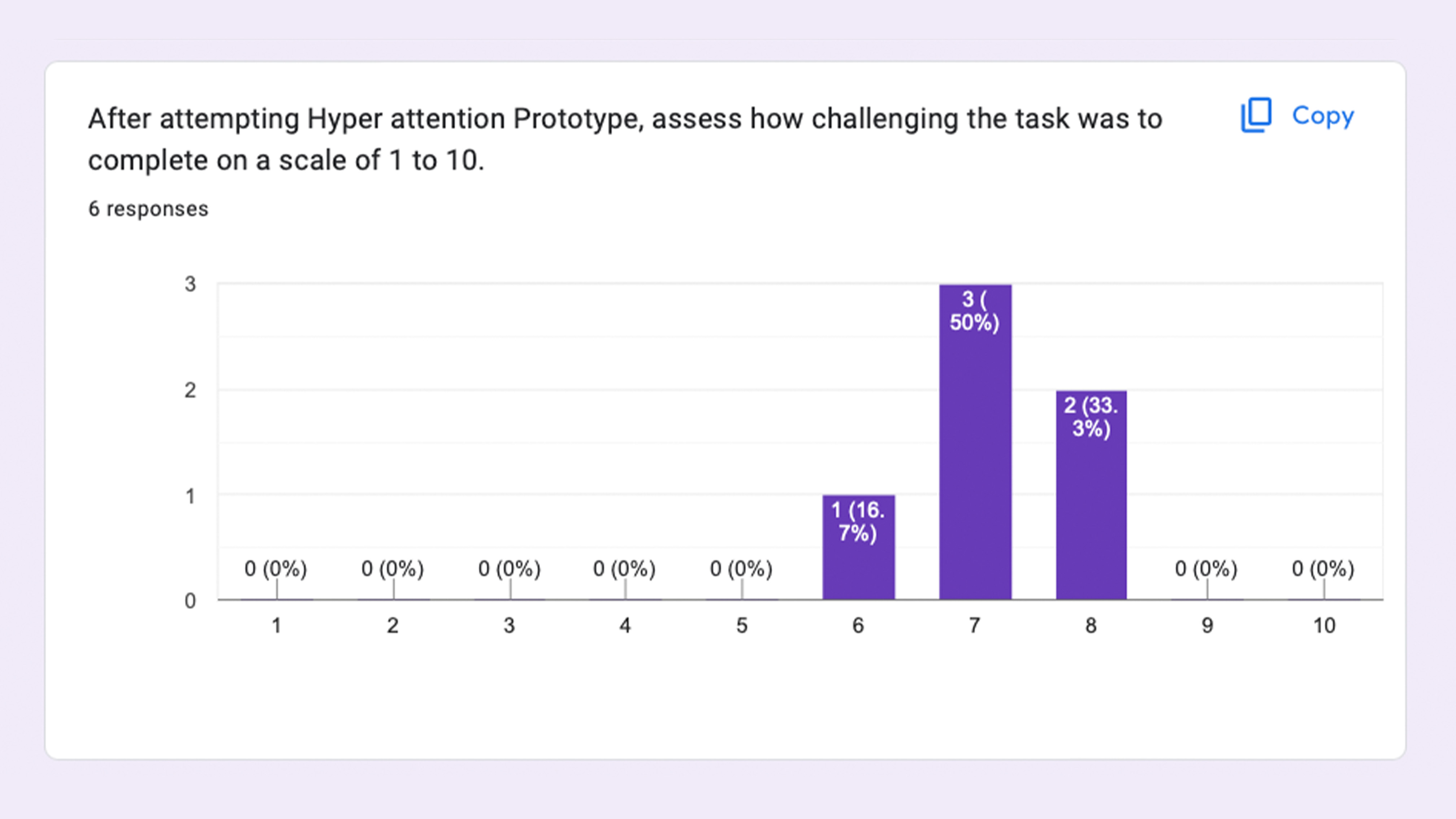
As anticipated, participants gave
questions
two and three of the activity an average score of seven for difficulty. Given that the
two tasks were theoretically similar, the same average score was anticipated. They did
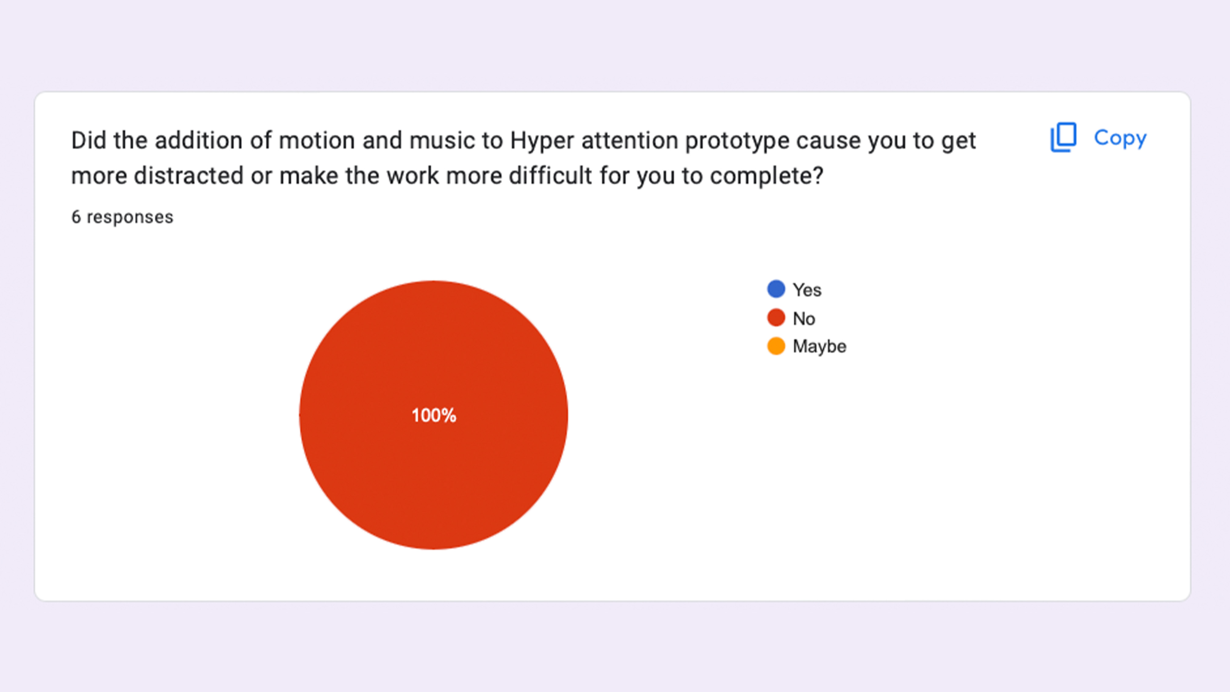
see that the prototype's use of motion and music did not cause them to become distracted
or impede their ability to finish the task, which is why questions two and three
received the same score.
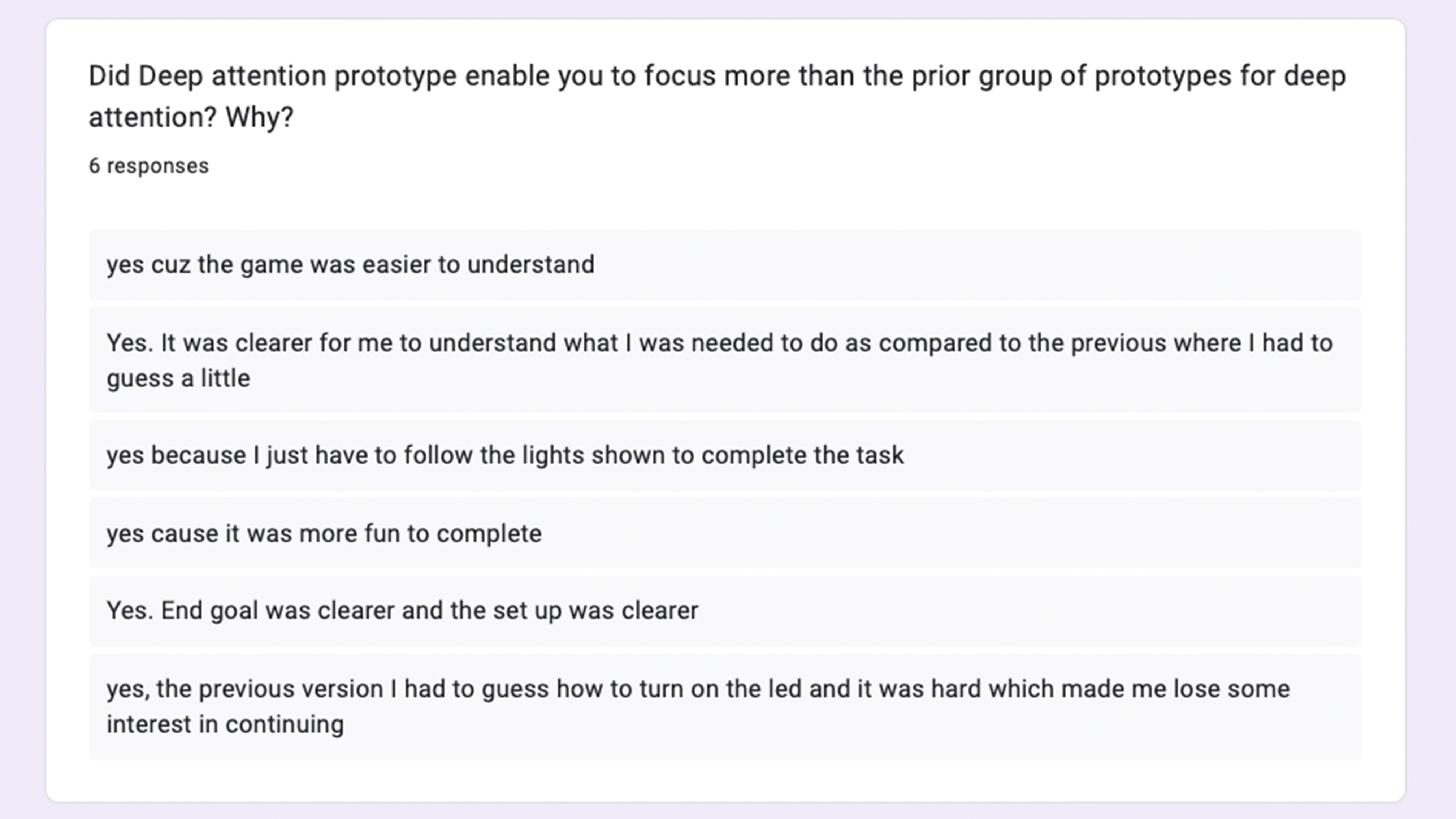
Based on the input, it appears that there was little difference in focus between
prototype D and the prior version. It's also crucial to remember that some respondents
indicated that the assignment's simplicity made it much easier for them to desire to
finish it. In prototype D, users also had to concentrate and commit the shown sequence
to memory in order to finish the game.
The incentive to 'win' and finish the
game was increased by the fact that it was in a more gamified setting. Based on the
strategies to capture attention mentioned previously, it seems that a more defined
direction
towards the end outcome helped prototype D's overall flow and attention. With respect to
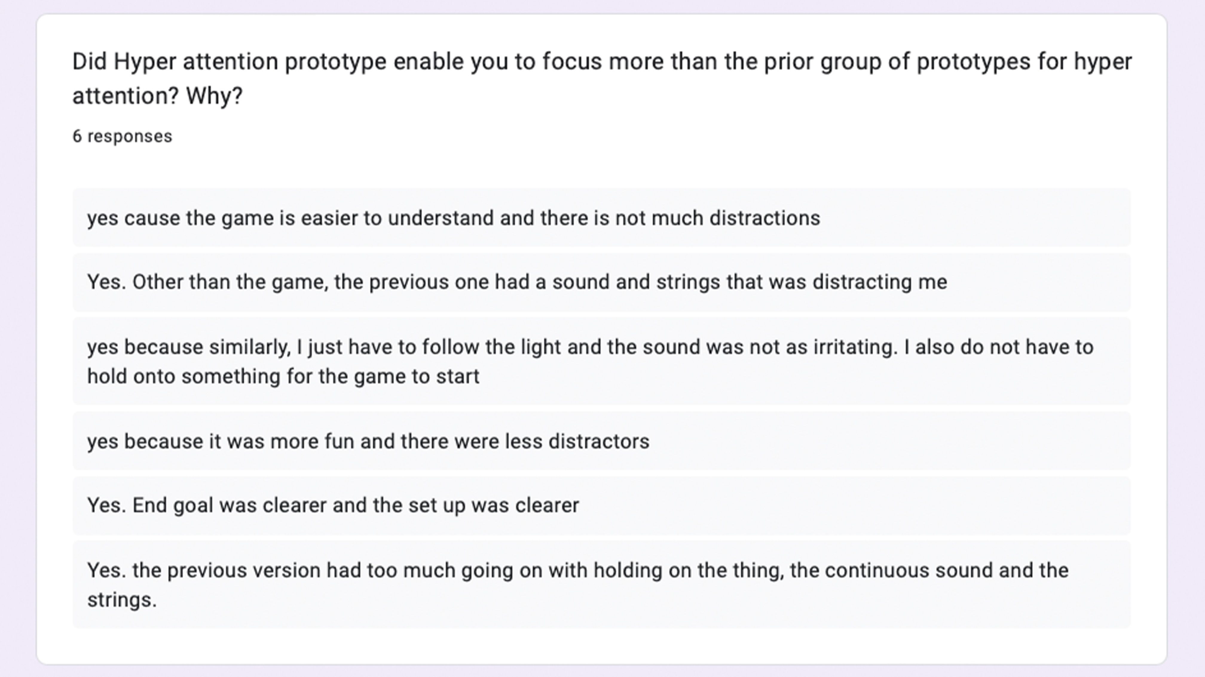
prototype H, discernible differences existed in the feedback obtained.
All of
them
claimed that prototype H made it easier for users to focus on the work at hand than the
previous prototype. Apart from the unclear nature of the assignment, the previous
prototype's sound and movement caused users to become distracted and lose interest in
continuing. Because of Prototype H's more reserved demeanour and sound, individuals were
able to focus on their tasks without being distracted.
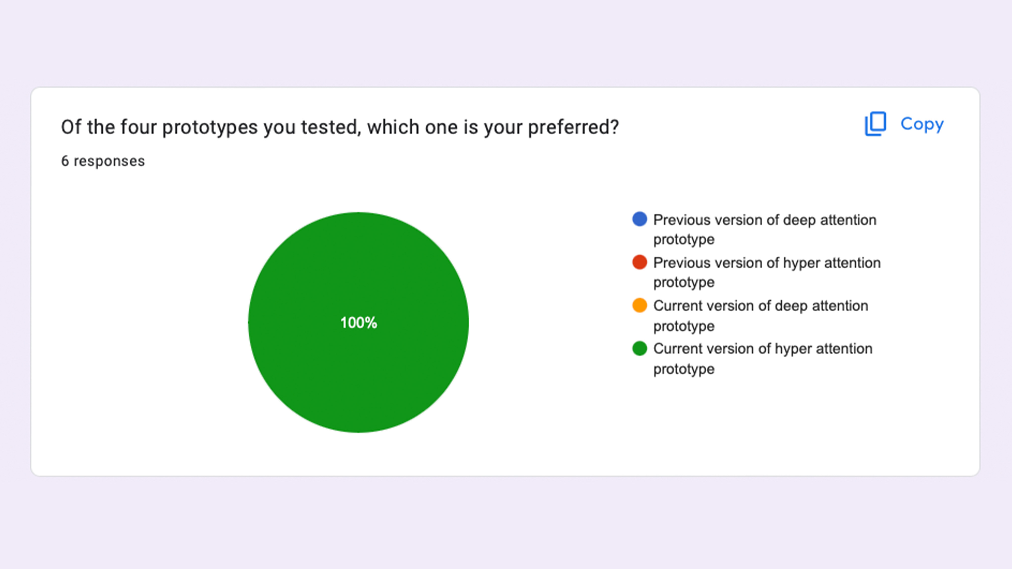
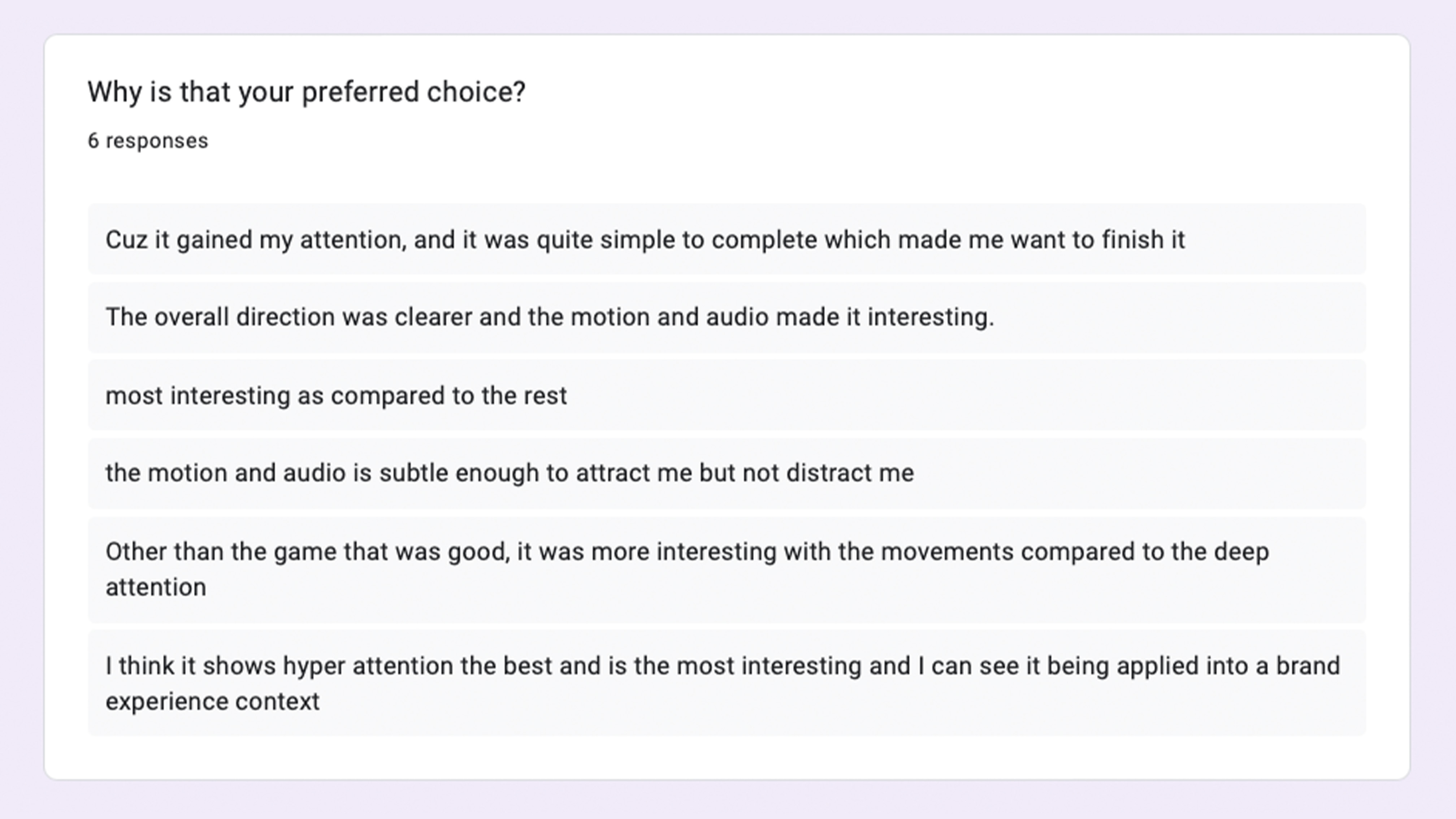
The results all indicated that, among the four, they preferred prototype H the most. Because of the task's simplicity and the game element, they were able to concentrate on the prototype without feeling pressured.
Out of all the prototypes, Prototype H was the most visually stunning and did not negatively impact the user flow.
These results allow me to proceed with my dissertation and finish it in time for submission in week seven. I felt that it was decent enough to test out the techniques, even though there were some things that I believed could be improved, like including a brand in the experience. We can draw the conclusion that while my prototype's game kept users' attention long enough to finish it, the techniques I used did help it get noticed.
From this, we can conclude my research. Brand Experience is a strategic framework that allows a business to collaborate more effectively with design with the goal of creating value and engaging customers, even as the larger environmental context changes. The challenge of "how to allow users experience the brand if they are not going through with the experience" arises when interactive design and interactive installations are put up during a brand activation or in their retail location. Through user testing, I found that designers can enhance their success rate by following specific guidelines to capture and maintain attention.
However, it is crucial to emphasise a significant discovery from my study: while we can monitor changes in the user's attention span, our primary focus should be on effectively regaining the user's attention, rather than solely linking it to the assumed decline in human attention span.